Three pricing page formats compete for space on senior care websites: static comparison tables, interactive cost calculators, and guided consultation funnels. Each converts families at different rates, costs different amounts to build, and sends a different signal about your organization’s commitment to home care pricing transparency.
TL;DR: A static table is cheapest and fastest to launch but caps out on personalization. An interactive calculator drives the highest engagement per session. A guided funnel captures the most qualified leads. The right pick depends on your care model, inquiry volume, and willingness to maintain accurate data over time.
The cost gap between care settings is wide enough to paralyze families mid-search. Home care averages $6,478 per month versus $9,581 for a nursing home, according to A Place for Mom’s data. And that gap flips at higher acuity: U.S. News reports that nursing homes run $115,000 to $130,000 per year, while 24/7 in-home nonmedical care can exceed $300,000 annually. Families searching “assisted living vs. home care pricing” or “nursing home cost calculator” arrive on your site already drowning in numbers they can’t contextualize. Your care affordability comparison page needs to cut through that confusion, and the format you choose determines whether it actually does.
Here are the three options with honest tradeoffs for each.
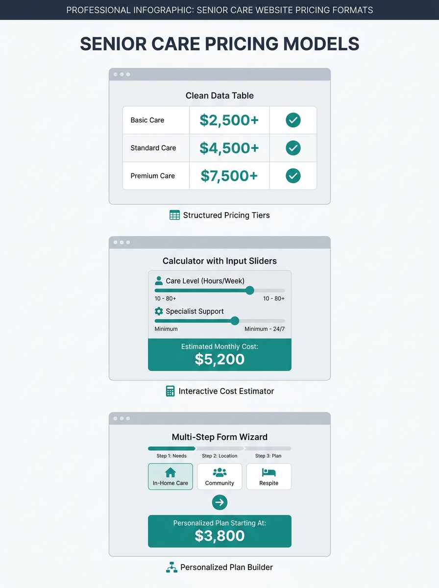
Static Cost Comparison Tables
A static comparison table presents fixed cost ranges for each care type (home care, assisted living, memory care, nursing home) in a grid families can scan in under 30 seconds. It’s the simplest senior care cost comparison tool to build and the cheapest to maintain.
Construction takes a web developer a few hours. You pull regional cost data from Genworth’s annual survey, your own rate cards, or published sources, then organize it into a scannable grid. No backend integrations, no dynamic pricing feeds, no JavaScript dependencies.
The strength is speed and clarity. Userpilot’s pricing page research concludes that pricing pages “should be as clear as possible to remove any conversion barriers.” A well-structured table answers the core question (what does each care option cost near me?) without requiring families to hand over personal data first. That matters because roughly half of first-time site visitors won’t fill out a form.
The tradeoff: static tables can’t reflect the cost variation driven by hours of care, acuity level, or geographic micro-market. A family needing 20 hours per week of home care and a family needing 60 hours per week will see the same number range. You’re giving them a compass, not GPS directions.
| Care Type | Avg. Monthly Cost | What’s Included | Best For |
|---|---|---|---|
| Home Care (20 hrs/wk) | $3,200–$4,800 | Personal care, companionship, meal prep | Moderate needs, strong home setup |
| Home Care (40 hrs/wk) | $6,400–$9,600 | Above + medication reminders, mobility | Higher daily needs, family nearby |
| Assisted Living | $4,500–$7,500 | Room, board, personal care, activities | Social engagement, moderate care |
| Memory Care | $6,000–$9,000 | Secured environment, specialized staff | Dementia, Alzheimer’s diagnoses |
| Nursing Home (Semi-Private) | $8,000–$10,800 | 24/7 skilled nursing, rehab, meals | Chronic medical conditions, post-hospital |
Ranges based on national averages; your metro will differ.
When this works best: You operate in a single metro, your rate card is relatively flat, and you want a care affordability comparison page live within a week. If you’re already building neighborhood-level service pages, a static table slots neatly into each location page without additional dev work.
Interactive Cost Calculators
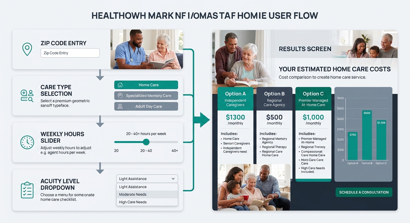
An interactive calculator lets families input their specific variables (zip code, hours needed, care level, room preference) and receive a personalized estimate. Seniorly and A Place for Mom both run production versions of this model. Seniorly’s calculator asks for location, care needs, and room preferences, then returns personalized estimates across care types. A Place for Mom’s version uses “proprietary data about local senior living partners” to generate cost estimates covering assisted living, memory care, and independent living in one view.
The conversion advantage comes from progressive commitment. Every input field a family completes deepens their psychological investment in getting an answer. By the time they’ve selected “memory care” and typed in their zip code, they want the payoff. The output screen becomes a natural home for a “Talk to our care advisor” CTA that feels helpful rather than pushy.
Neil Patel’s pricing page analysis recommends using “price anchoring to set context” and ordering options from most to least expensive while highlighting one recommended plan. Applied to senior care: when your calculator returns results, anchor the highest number first (24/7 home care at $300,000+ per year for high-acuity cases) so that your assisted living or part-time home care pricing feels proportional. This is honest context, and families deserve to see the full spectrum before narrowing down.
A family needing 20 hours a week and a family needing 60 hours a week shouldn’t see the same number. That’s where static tables fail and calculators earn their build cost.
The tradeoff: development expense. A functional nursing home cost calculator requires a data source that stays current, a backend mapping zip codes to regional pricing, and someone responsible for quarterly data audits. If your pricing data goes stale, the calculator erodes trust instead of building it. Budget $3,000 to $12,000 for initial development depending on complexity, plus 2 to 4 hours monthly for data maintenance.
When this works best: You serve multiple metros or multiple care levels, and you have staff or a vendor who can keep the underlying data fresh. If your marketing stack already includes automation tools connected to your CRM, the calculator’s form submissions can feed directly into lead nurturing sequences without manual data entry.
Guided Consultation Funnels
The third approach replaces a self-serve tool with a structured intake experience. Instead of showing families a number on screen, you ask them 4 to 6 questions (care needs, budget range, timeline, location) and then route them to a care advisor who delivers a personalized cost breakdown over the phone or video call.
This is the highest-touch format. Families who complete it are further along in their decision process and convert to admissions at a measurably higher rate than calculator users. The psychology tracks with what the family decision process actually looks like: adult children researching on behalf of a parent often want a human to confirm what the numbers mean, not another spreadsheet to interpret alone.
The intake form itself becomes your senior care cost comparison tool in disguise, because the advisor can walk the family through assisted living vs. home care pricing in real time. They can factor in the family’s specific financial picture, including long-term care insurance, VA benefits, and Medicaid eligibility, which no automated calculator handles well.
Warning: If your intake team can’t respond within 2 hours during business hours, this format will hurt you. A family who fills out a 6-question form at 10 PM and doesn’t hear back until 3 PM the next day has already called two competitors.
The other tradeoff: you lose “browse and compare” visitors who wanted quick numbers without talking to anyone. For some families, the absence of visible pricing on your site feels like you’re hiding something, which actively damages the home care pricing transparency signal you’re trying to send. The affordability gap in senior living is already a source of anxiety. Making families request a call before seeing any dollar figure can amplify that anxiety rather than ease it.
When this works best: Your average client value exceeds $5,000 per month, your intake team responds within 2 hours, and your admissions process already involves a consultative conversation before enrollment. If you’ve been diagnosing lead flow problems, consider whether your current inquiry process converts well enough to justify routing all pricing traffic into human conversations.
How To Choose Between These Three
The honest answer for most providers: start with the static table and plan your way toward a calculator. The guided funnel is a later-stage play for organizations with the staff capacity to handle real-time follow-up.
| Factor | Static Table | Interactive Calculator | Guided Funnel |
|---|---|---|---|
| Build cost | $200–$500 | $3,000–$12,000 | $1,000–$3,000 |
| Time to launch | 1–3 days | 3–8 weeks | 1–2 weeks |
| Data maintenance | Low (quarterly updates) | High (monthly audits) | Low (advisor stays current) |
| Best visitor intent | Early research | Active comparison | Ready to decide |
| Estimated inquiry rate | 2–5% | 5–12% | 15–30% |
| Staffing requirement | None | Minimal | Intake team with fast response |
Providers who serve a single care type in a single market can run a static table indefinitely and convert well. Multi-service, multi-location organizations that want their care affordability comparison page to do genuine lead qualification should invest in the calculator. And the funnel makes sense when your operations team can guarantee sub-2-hour response times.
The format matters less than the commitment to keeping it honest and current. A stale calculator or a funnel that leads to voicemail will damage trust faster than having no pricing page at all. Families comparing nursing home cost calculator tools across three provider websites will remember which one gave them a straight answer. If you’re unsure which format fits your current operations and market, get in touch with Care Marketing to walk through the specifics together.